
This chart shows that the top 50% of New Yorkers paid 99.8% of income taxes in 2023.
Analyzed by Swipebot
Loading analysis...

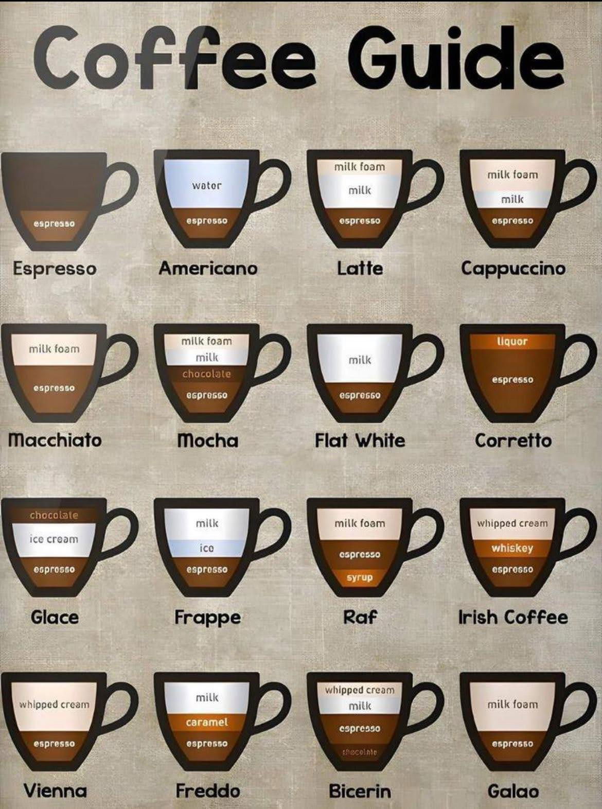
A simple, visual breakdown of 16 popular coffee drinks. This chart helps anyone order (or make) their perfect cup

This is a pretty cool graphic that shows the progression of how the Tesla headlights look from 2012 all the...
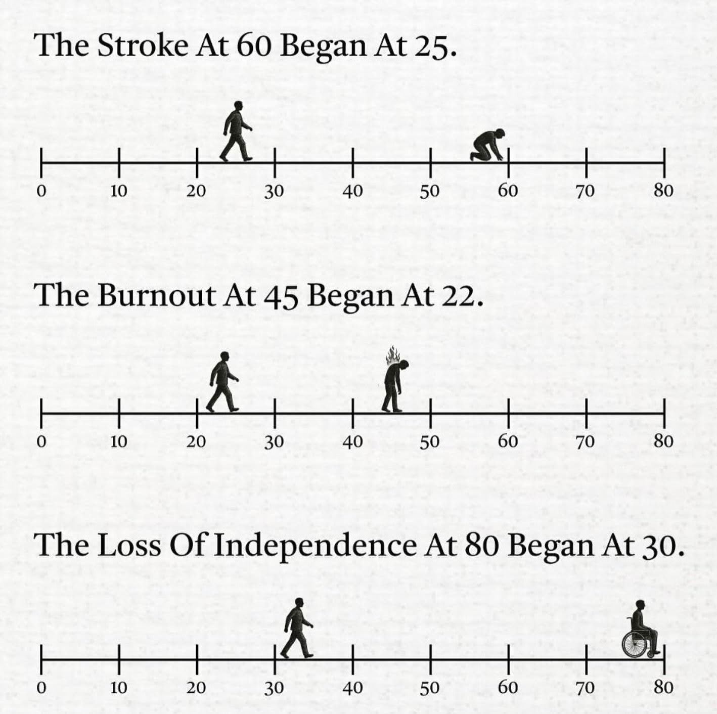
Impactful timeline showing how events progressed. If you take steps earlier in prevention of strokes, burnout and independence.
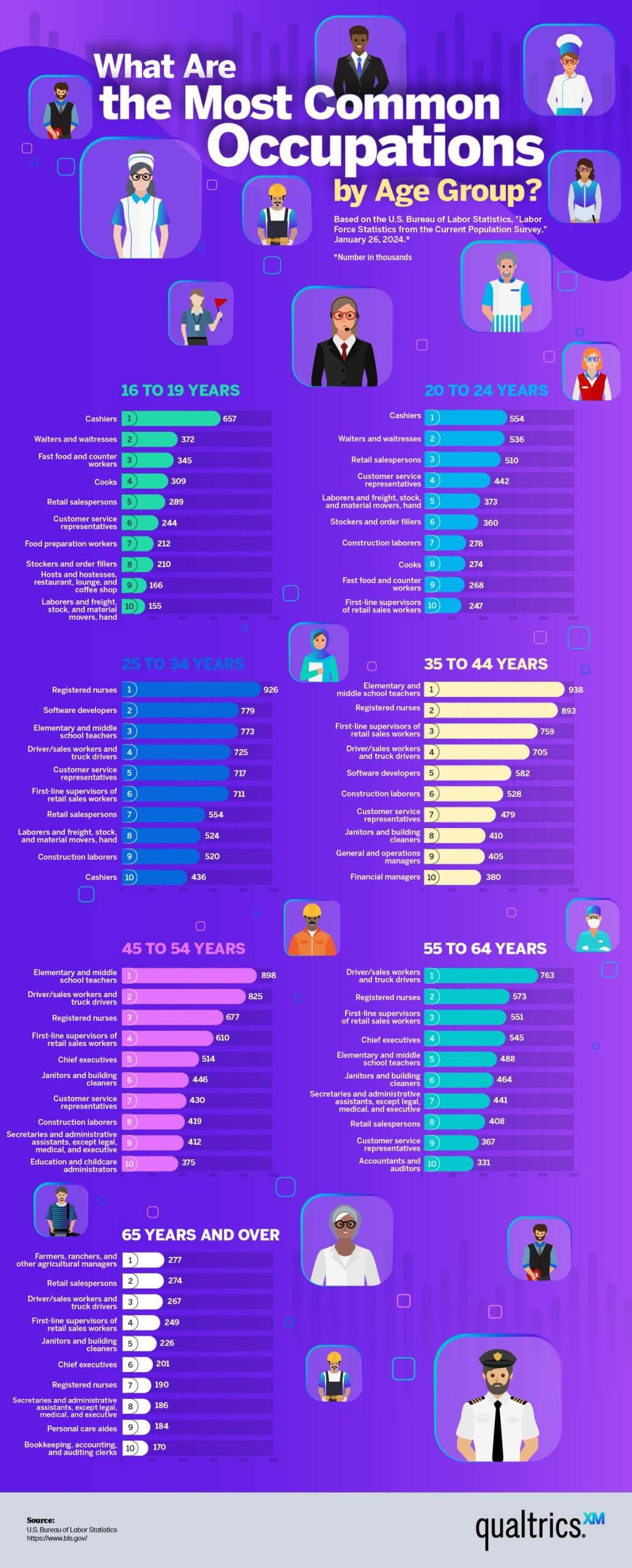
This was an interesting way to show data of the most common jobs by AGE.The data showed:16 to 24 years:...

A quick cheat sheet of poker hand rankings — from best to worst. I like simple little charts like this...
To me, an image like this packs in a lot of data in a very easy-to-understand method.