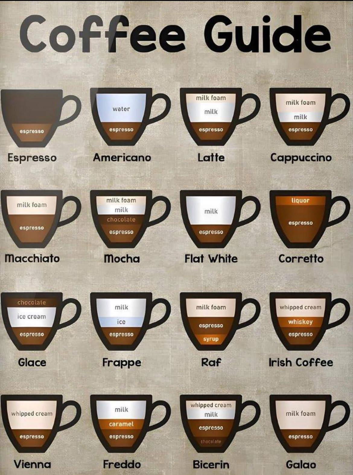
A simple, visual breakdown of 16 popular coffee drinks. This chart helps anyone order (or make) their perfect cup
Analyzed by Swipebot
Loading analysis...

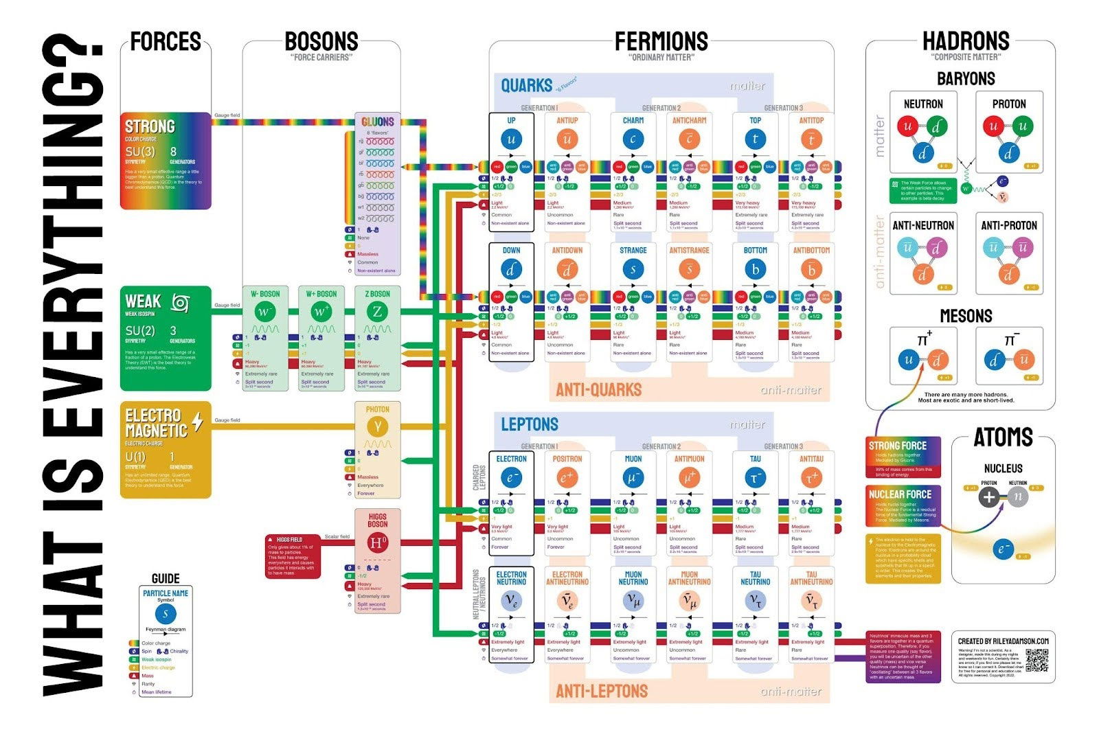
This isn't a very simple graphic, but it shows what everything is based down to the fundamental particles that we...

This image contrasts the downsides of overpaying executives—like drained resources and stalled growth—with the benefits of proper compensation, such as...

This chart shows how American went from bringing in revenue from manufacturing in 1990 to bringing in revenue from healthcare...
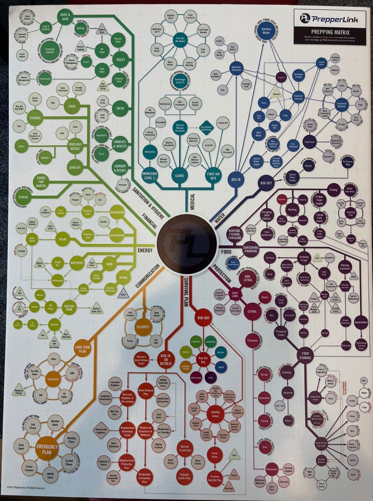
I didn't actually read through all of these different scenarios, but this is a cool graph for a prepper (someone...
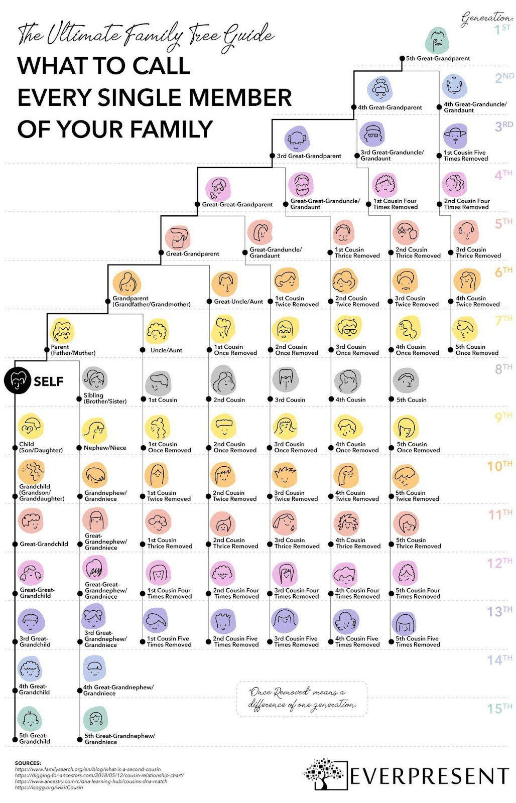
This colorful one-pager breaks down what to call every single family member—across 15 generations.
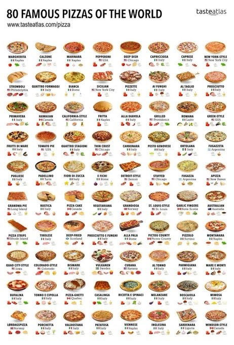
This chart takes 80 different pizzas, lists out where they’re from and also some other qualities about them. I like...