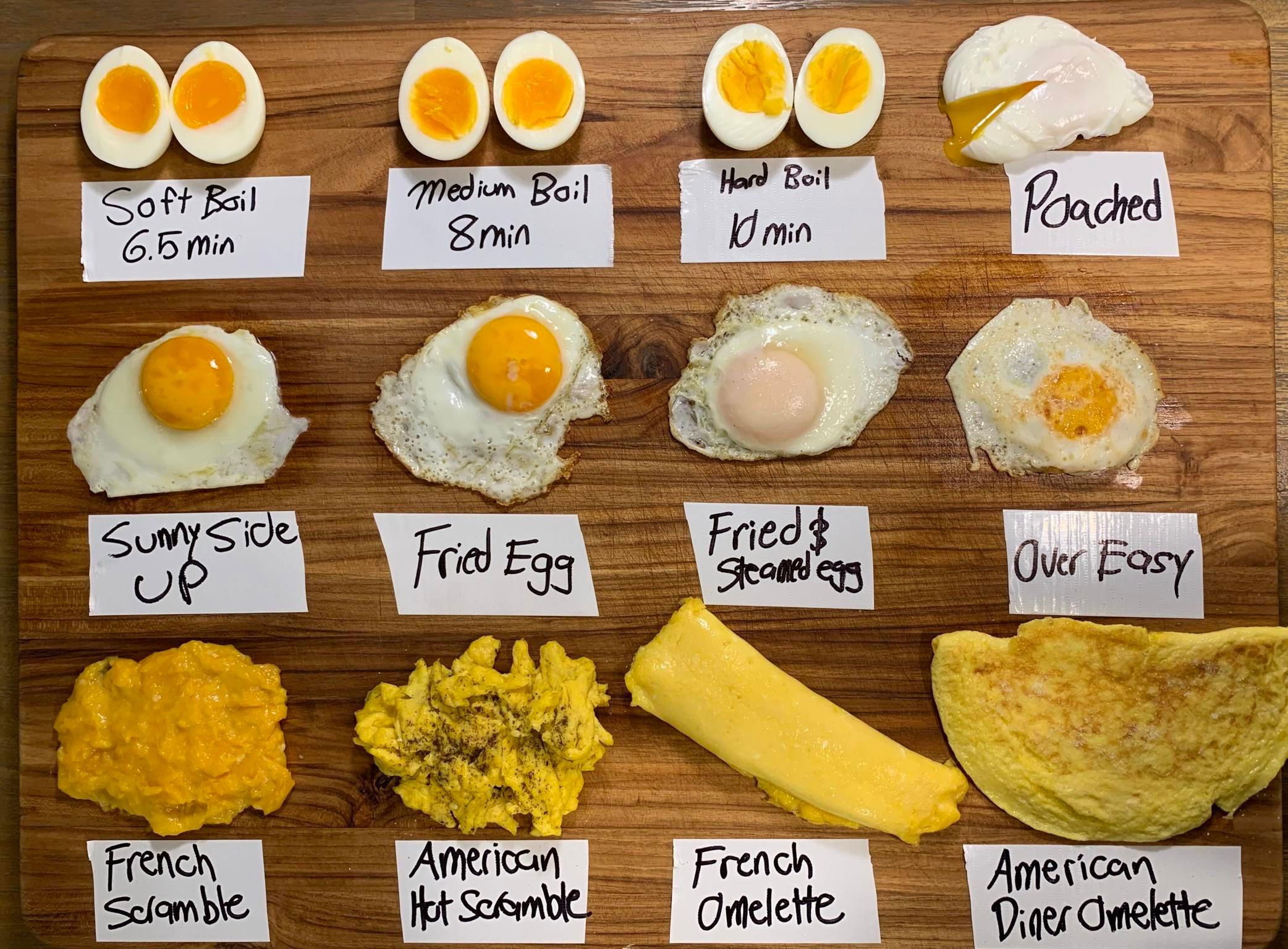
To me, an image like this packs in a lot of data in a very easy-to-understand method.
Analyzed by Swipebot
Loading analysis...

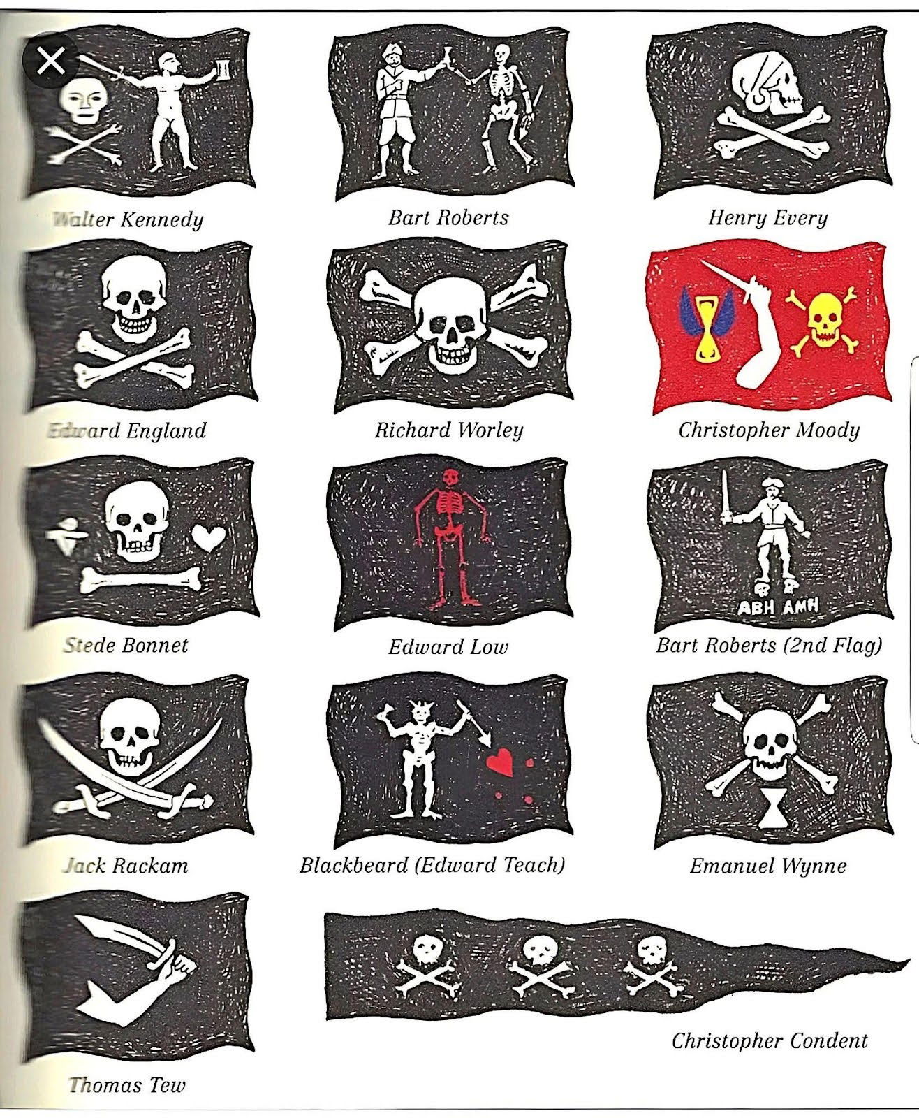
This simply lists out all the different types of pirate flags that you would find.

This chart shows how American went from bringing in revenue from manufacturing in 1990 to bringing in revenue from healthcare...
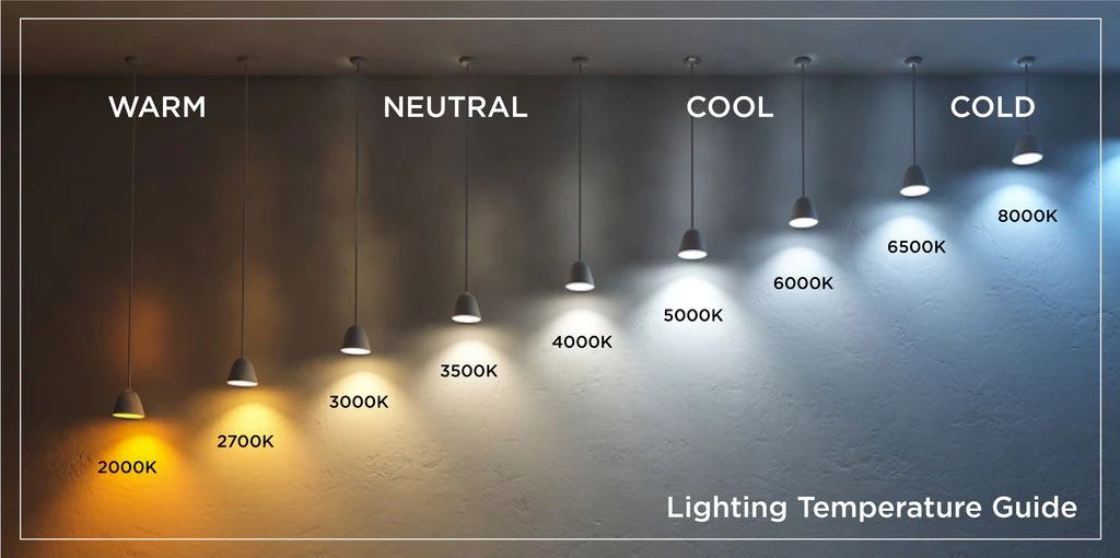
This is a very simple yet very cool guide that shows the difference between warm, neutral, cool, and cold lighting....
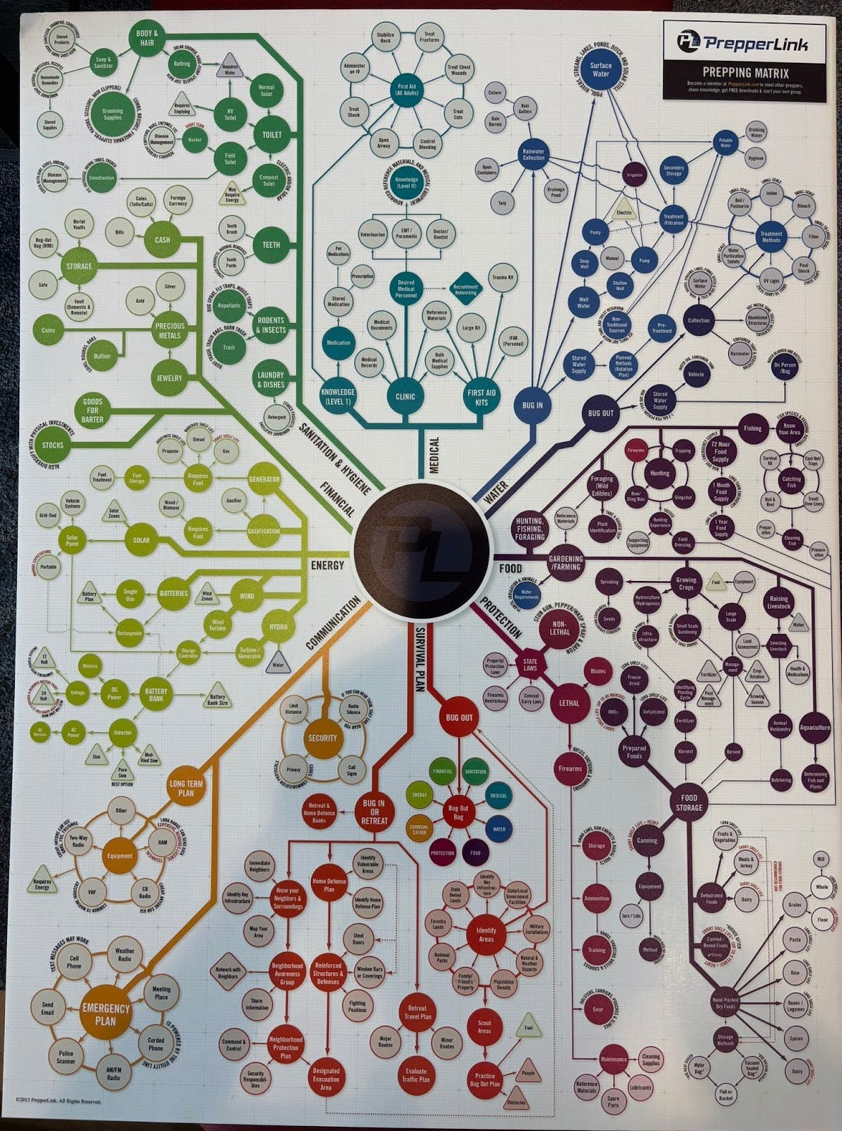
I didn't actually read through all of these different scenarios, but this is a cool graph for a prepper (someone...

This image contrasts the downsides of overpaying executives—like drained resources and stalled growth—with the benefits of proper compensation, such as...
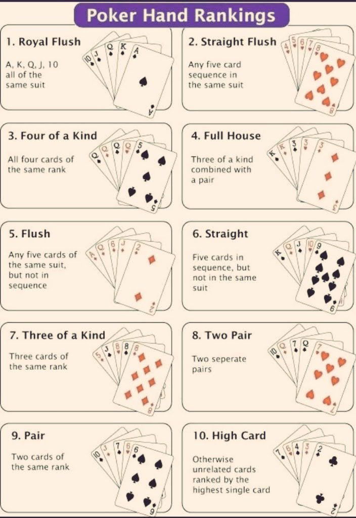
A quick cheat sheet of poker hand rankings — from best to worst. I like simple little charts like this...