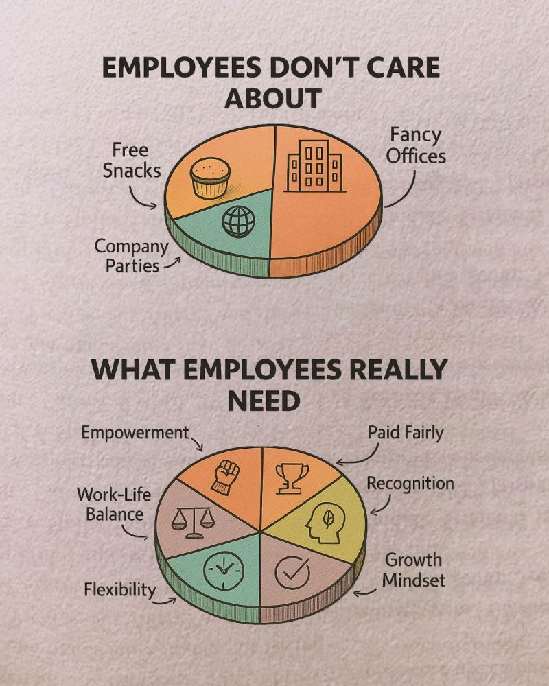
What employees really care about — and what companies keep getting wrong.
Analyzed by Swipebot
Loading analysis...

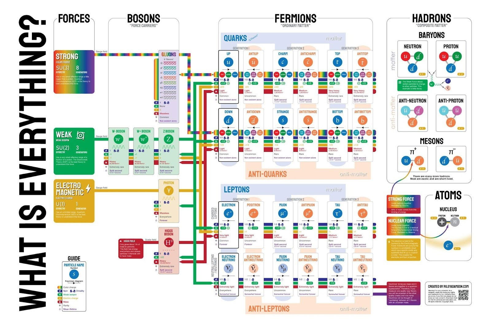
This isn't a very simple graphic, but it shows what everything is based down to the fundamental particles that we...

This chart shows that the top 50% of New Yorkers paid 99.8% of income taxes in 2023.

This is a pretty cool graphic that shows the progression of how the Tesla headlights look from 2012 all the...

To me, an image like this packs in a lot of data in a very easy-to-understand method.

This image contrasts the downsides of overpaying executives—like drained resources and stalled growth—with the benefits of proper compensation, such as...
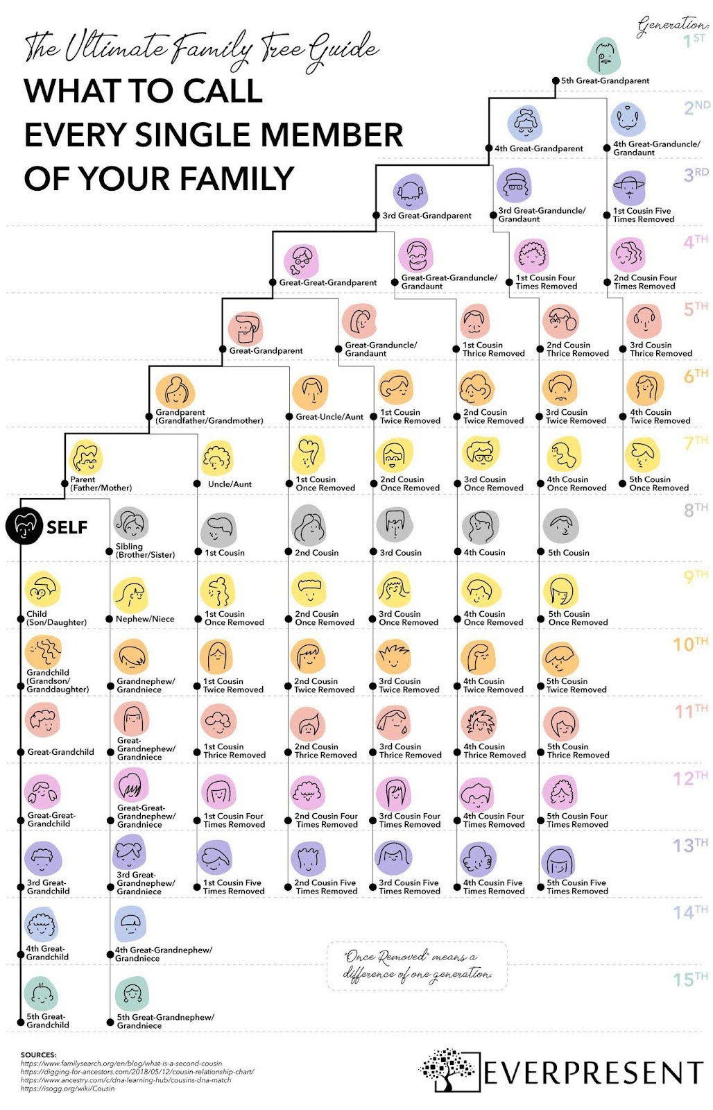
This colorful one-pager breaks down what to call every single family member—across 15 generations.