
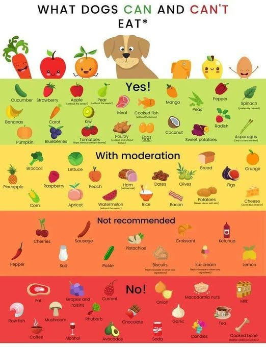
I like simple images that convey a BUNCH of data, and in one Instagram-sized post this shows what dogs can eat, what they eat in moderation, what’s not recommended, and what’s flat-out dangerous for them to eat.

This chart shows that the top 50% of New Yorkers paid 99.8% of income taxes in 2023.

This is a very simple yet very cool guide that shows the difference between warm, neutral, cool, and cold lighting....

Having a longterm goal is very important.If you don't, you might just do random things that add up to nothing...

This isn't a very simple graphic, but it shows what everything is based down to the fundamental particles that we...

What employees really care about — and what companies keep getting wrong.

This was an interesting way to show data of the most common jobs by AGE.The data showed:16 to 24 years:...