The Website Complexity Trap
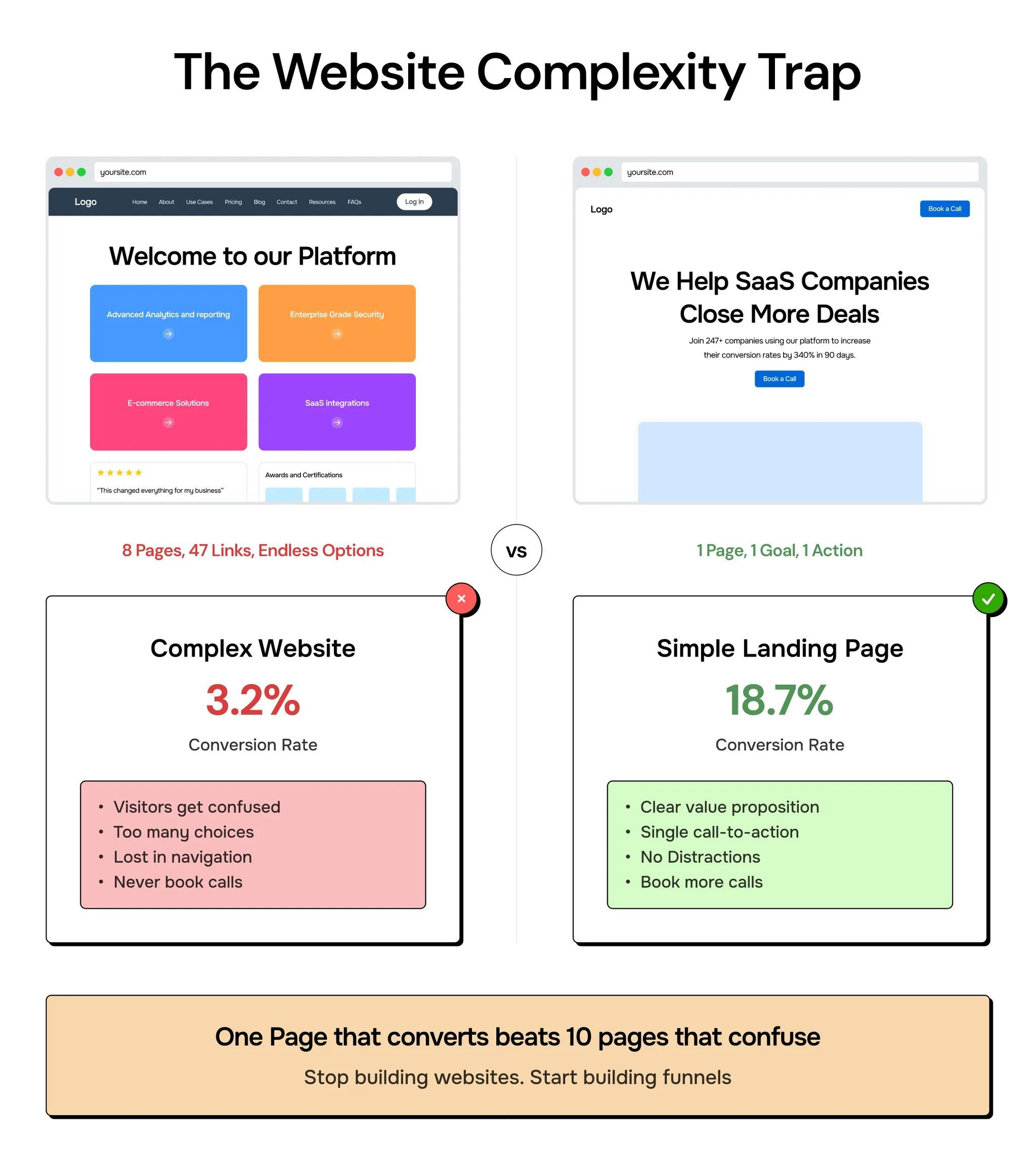
Complex websites do worse than simple websites.
Customers generally don't care about cool boxes and gradient colors, but what it can do for them.
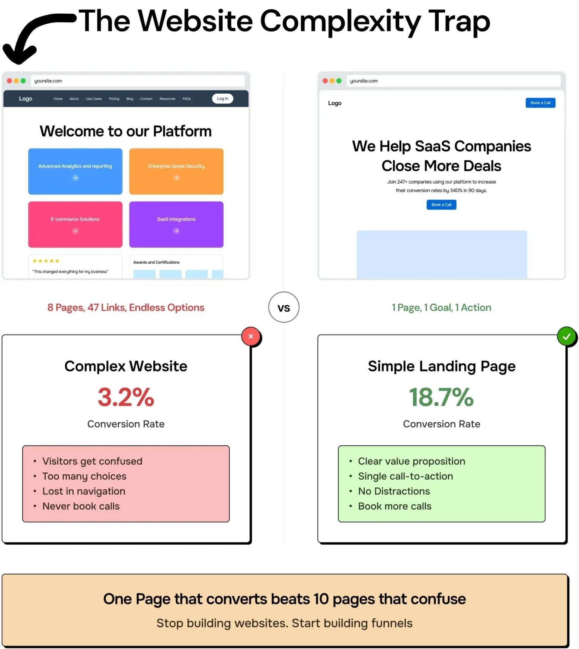
I like this concept by Namya because as there's so many "beautiful" templates you can buy online for your website...but a lot of them are just overly complete.
Same with emails.
My email template is literally a blank page.....the only "design" is typography!
Here is what Namya @ Supafast said in her instagram post with this image:
One of the biggest concerns I get on calls:
- Do we need a full website or just a landing page?
- Maybe we need multiple pages to look legit?
- Should we have a use cases page?
- What about pricing?
I watch founders talk themselves into complexity in real time.
They've got solid products. Happy customers. Growing revenue. But they're convinced they need 8 pages to look professional.
Here's what I tell them:
Your job isn't to impress other founders with your site architecture. It's to get buyers to book calls.
One page that converts beats 10 pages that confuse.
- Strip it down to one landing page.
- Simple CTA.
|- Book a call.
That's it.
Most feel weird about it at first. Like they're 'cheating' somehow.
But simple scales, fancy fails.
Stop building websites. Start building funnels.