Icon Comparison Chart
Published on Aug 11, 2025
Icon vs. everyone else — one chart showing how it crushes tools like ChatGPT, CapCut, and more with ad-focused AI, creative workflows, and pro features.
Analyzed by Swipebot
Loading analysis...
Icon vs. everyone else — one chart showing how it crushes tools like ChatGPT, CapCut, and more with ad-focused AI, creative workflows, and pro features.
Search for a command to run...

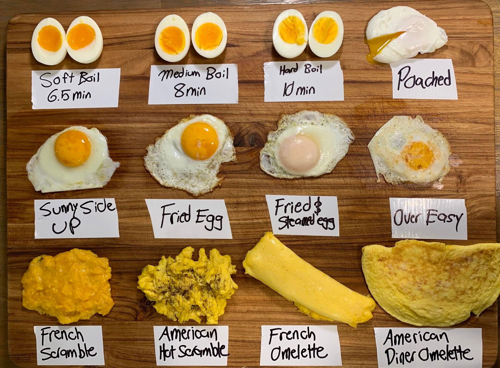
To me, an image like this packs in a lot of data in a very easy-to-understand method.

The featured infographic brilliantly displays S&P 500 10-year returns with an organized layout and strategic use of color. The green...
I LOVE the layout of this ad, where it shows alllllll the different softwares you've gotta use for making ad...
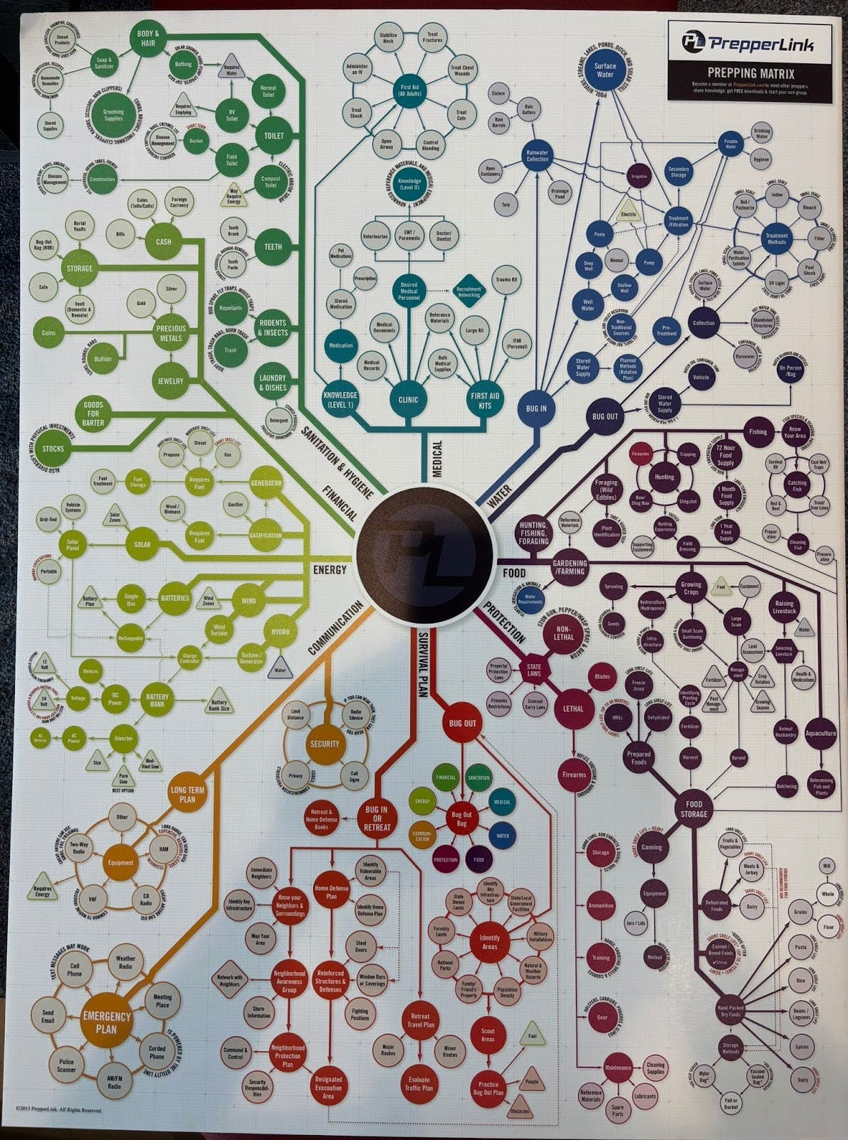
I didn't actually read through all of these different scenarios, but this is a cool graph for a prepper (someone...
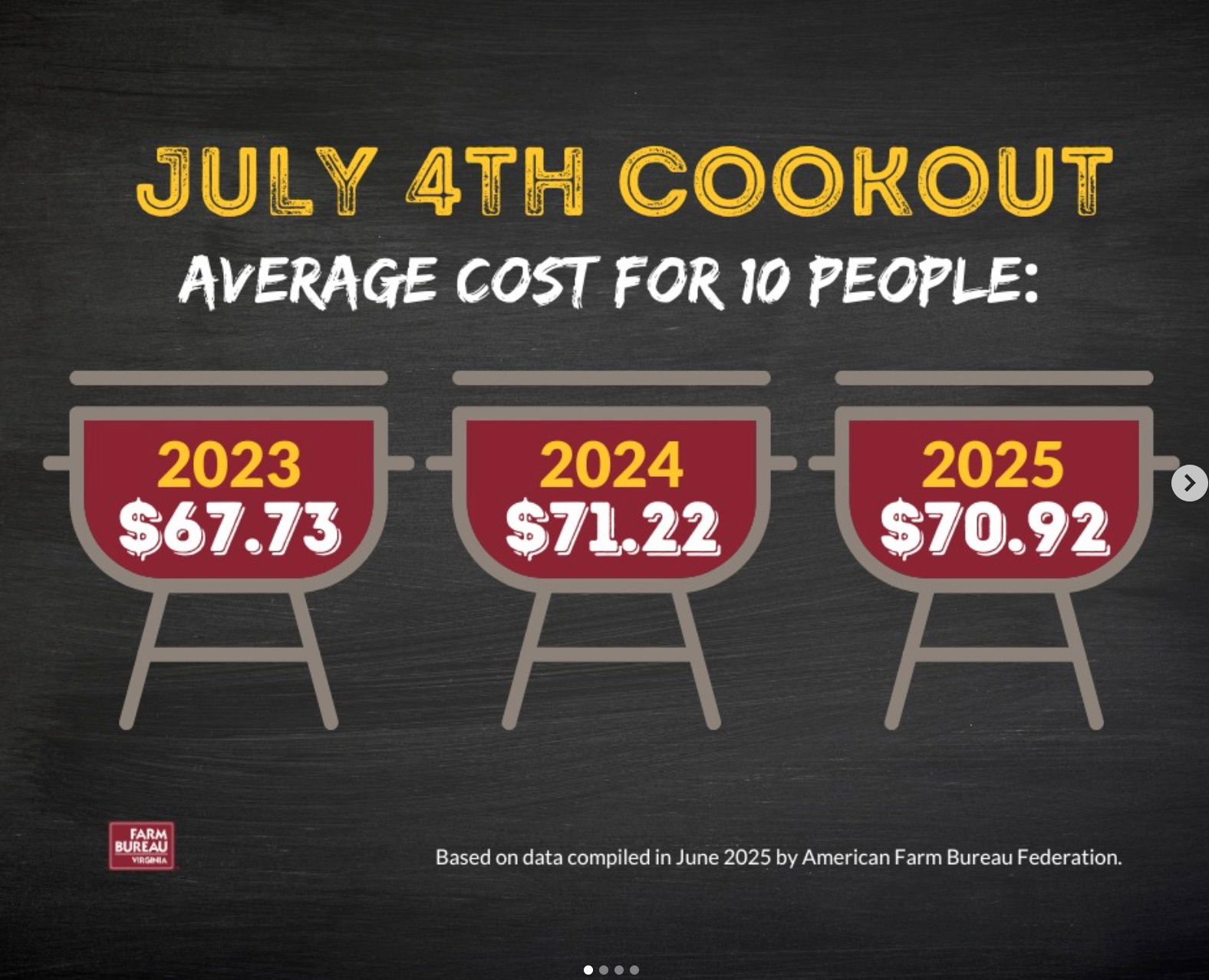
Smart July 4th reminder: While you're enjoying your cookout, this ad highlights how little actually goes to the farmers —...
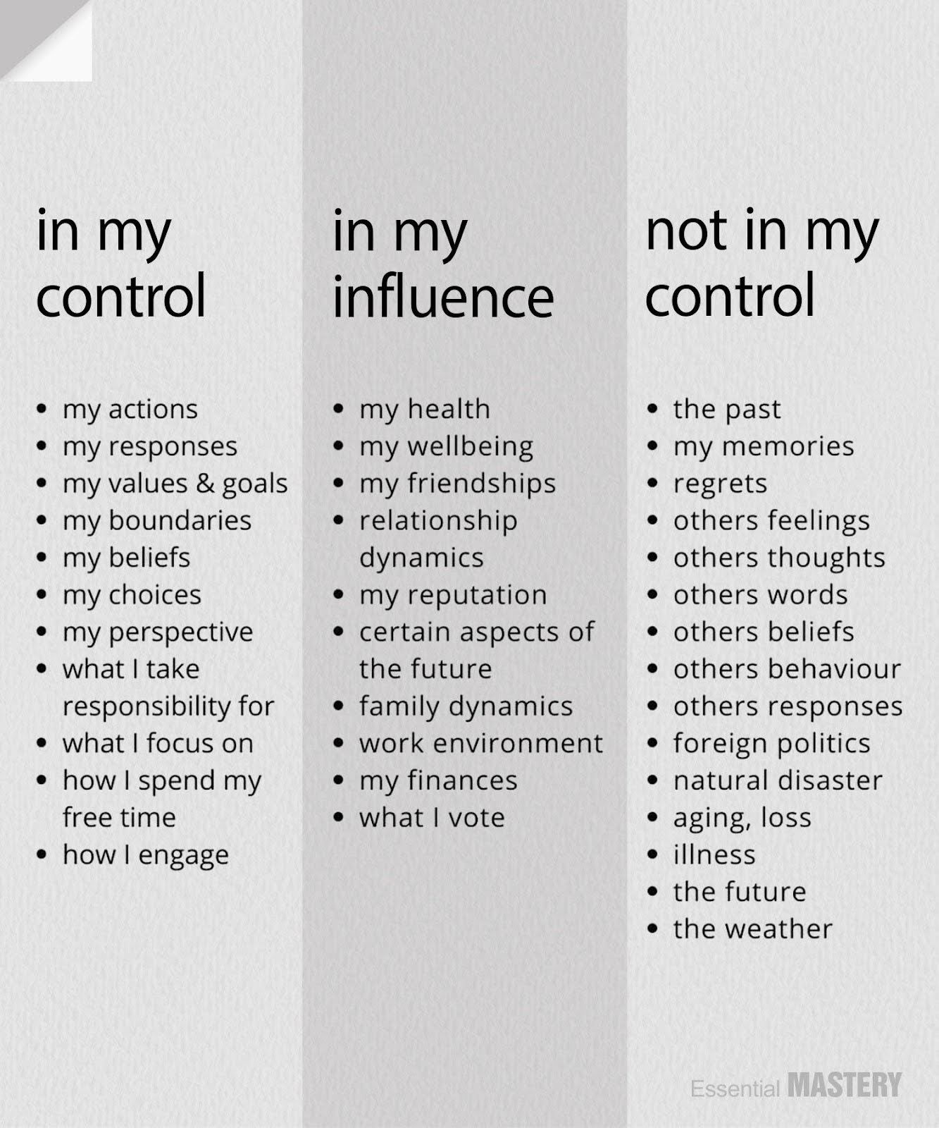
This is a great reminder that you personally can FULLY control certain things, partially influence others, and not control certain...