Superads Before and After Graphs
Published on Jun 6, 2025
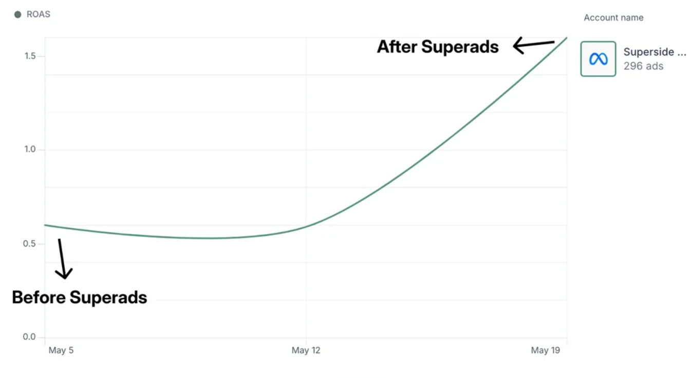
Before and after graph from using Superads.ai to improve your creative.
I love a simple chart that goes up-and-to-the-right.
Analyzed by Swipebot
Loading analysis...
Before and after graph from using Superads.ai to improve your creative.
I love a simple chart that goes up-and-to-the-right.
Search for a command to run...

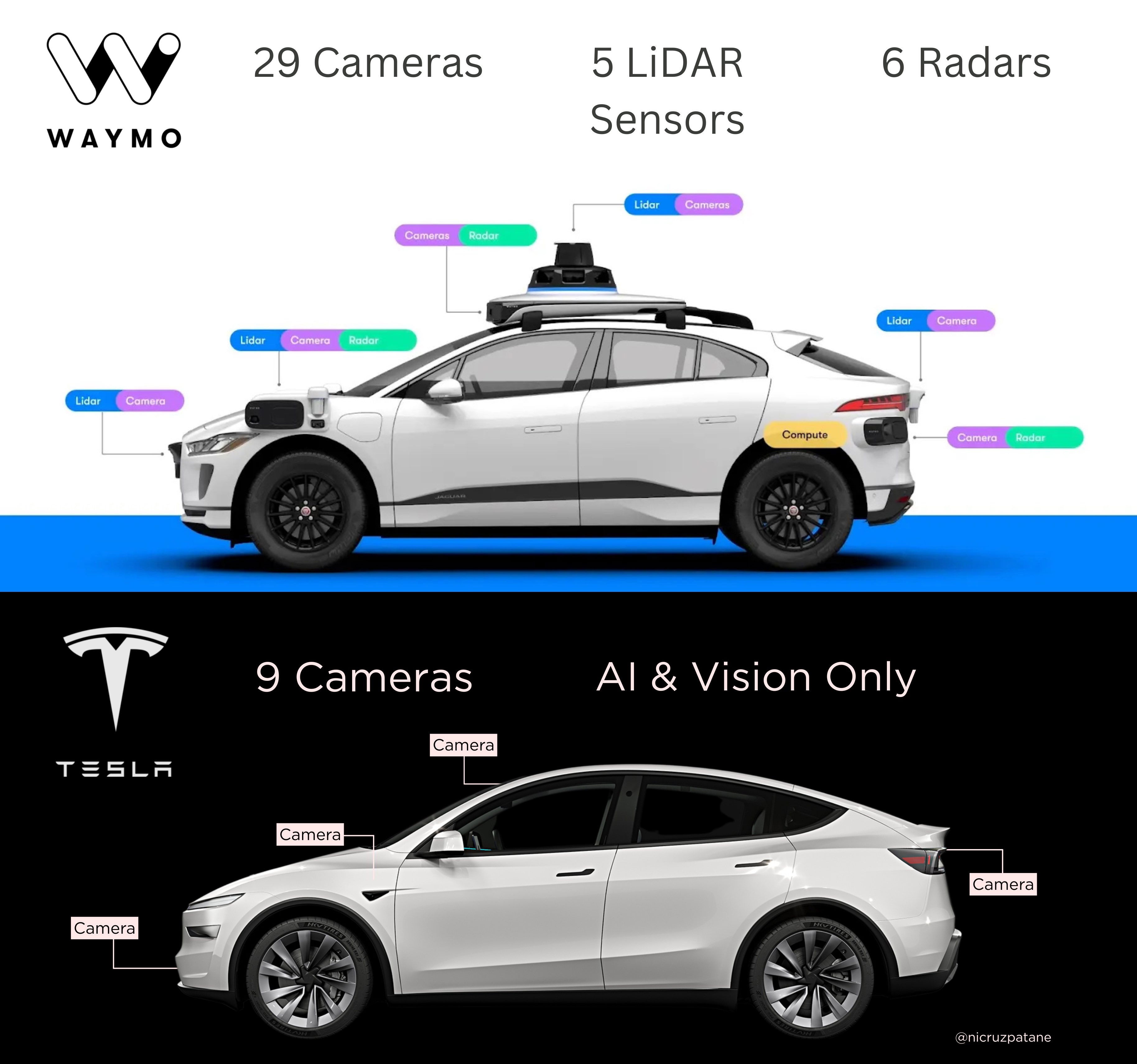
This shows the difference between Waymo and Tesla cameras. It shows that Waymo has a lot more cameras (29), five...
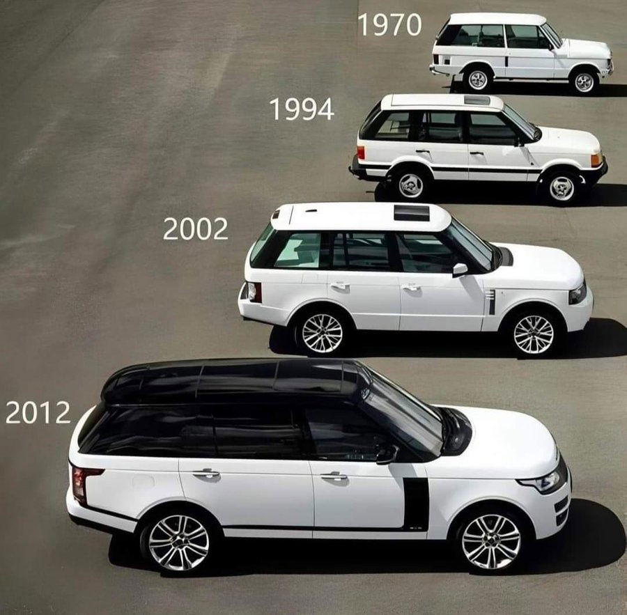
This is a cool chart that shows the styling evolution of Range Rovers from 1970 to 2012…while each successive versions...

Comparison charts are an amazing way to show your YOUR PRODUCT versus your competitors product, and they're very simple.In one...
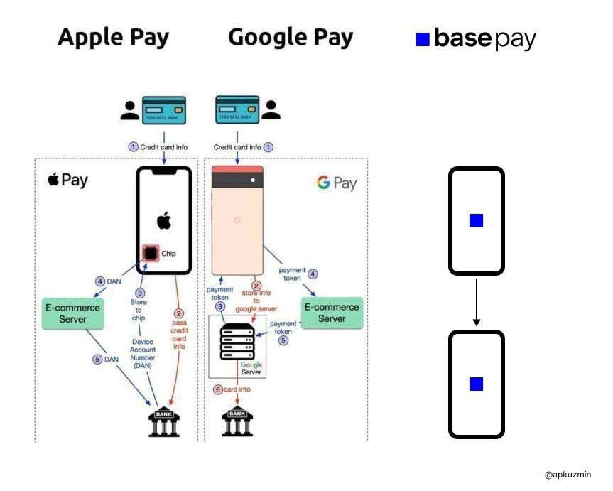
This chart breaks down how Apple Pay and Google Pay process transactions. Apple Pay uses a chip. Google Pay uses...
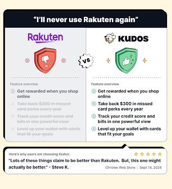
A bold comparison ad calling out Rakuten and positioning Kudos as the smarter choice.
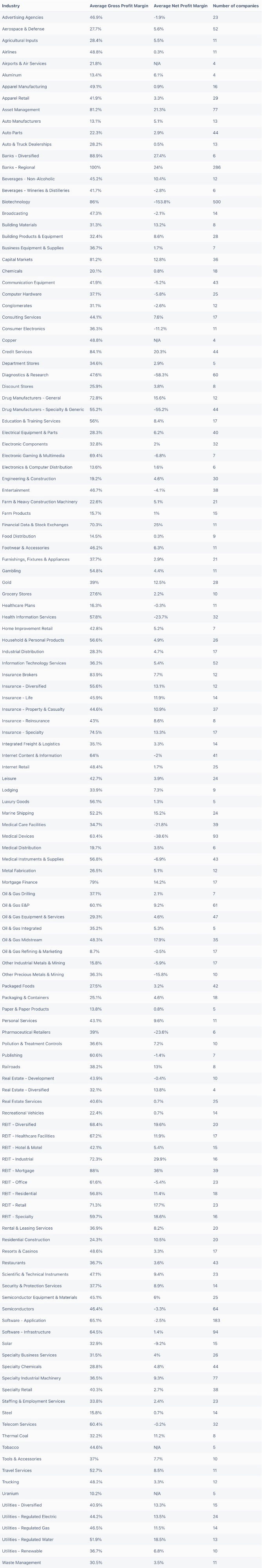
This is a cool list of the industries with the highest average profit margin.The highest average profit margin industries are:...and...