
If you ever wondered how you compare against others your age for net worth. This simple chart clearly breaks it down by age and percentile.
Analyzed by Swipebot
Loading analysis...
If you ever wondered how you compare against others your age for net worth. This simple chart clearly breaks it down by age and percentile.
Search for a command to run...


This shows the signups for a startup, and how it compounds over time then suddenly “comes out of nowhere” but...

This chart shows how American went from bringing in revenue from manufacturing in 1990 to bringing in revenue from healthcare...
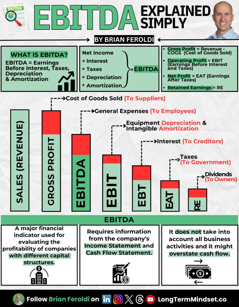
Warren Buffet and Charlie Munger famously hated the "EBITDA" method of calculating profit, because it doesn't account for allllll the...

To me, an image like this packs in a lot of data in a very easy-to-understand method.
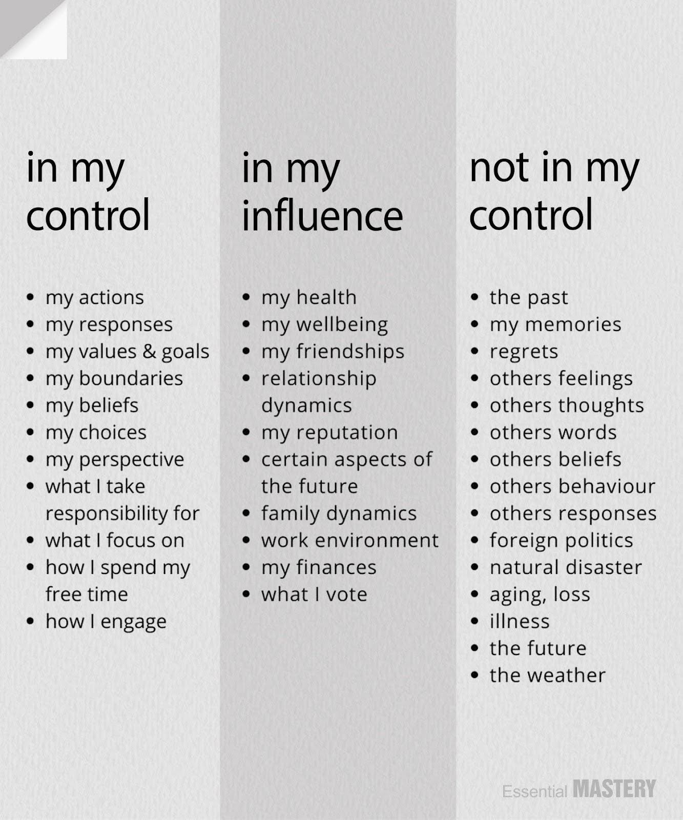
This is a great reminder that you personally can FULLY control certain things, partially influence others, and not control certain...

I thought this was a cool ad by BeeHiiv that shows how you can save tons of time running an...