For social proof sections I love the concept of showing a BIG NUMBER and smaller text explaining it. Like this :)
100%
of SwipeFile readers are awesome!
Analyzed by Swipebot
Loading analysis...
Search for a command to run...


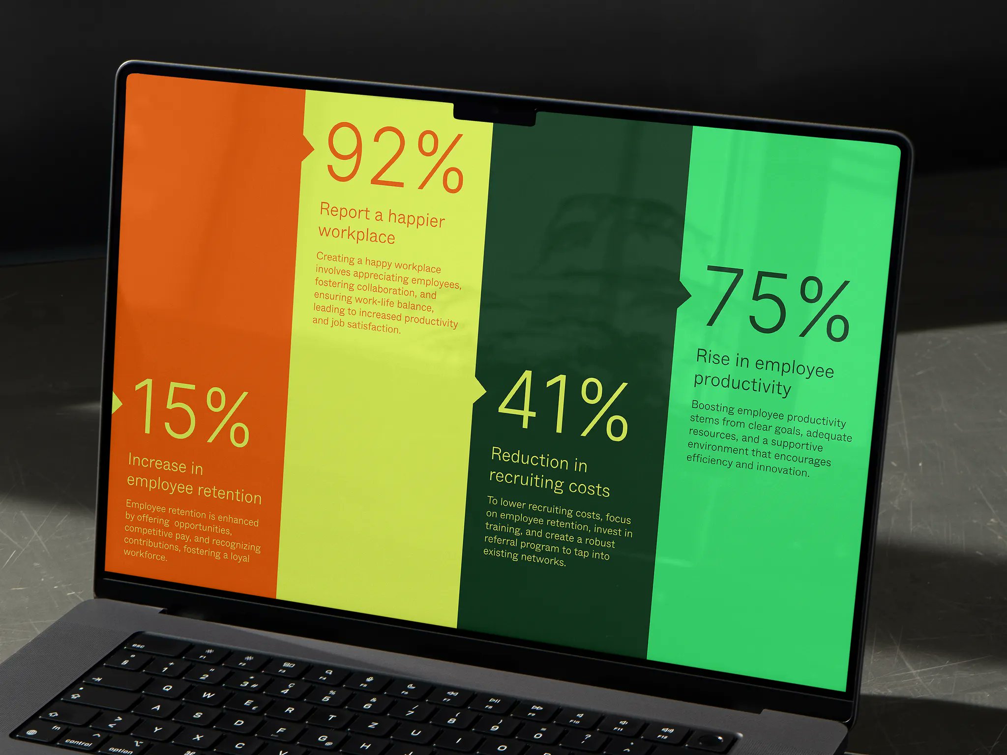
Designer Anthony Miller gives some good advice that large numbers in your pitch deck design makes everything so much more...

Eye-popping image showing what you could eat instead of scarfing down a Big Mac meal
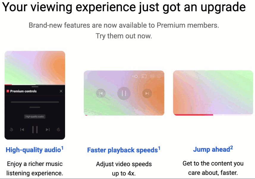
This great email from YouTube uses the ole "Show, Don't Tell" method to showcase some new features. It doesn't need...
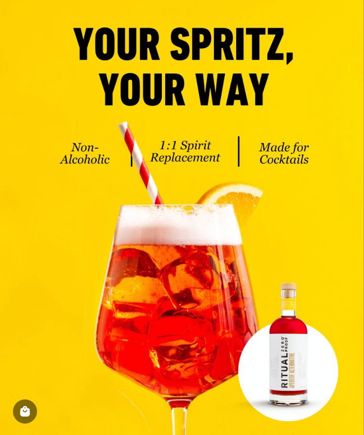
This ad swaps the booze without losing the vibe. Ritual’s headline "Your Spritz, Your Way" perfectly captures that you can...

I like this "Digital Marketing Engine" angle from GoHighLevel mixed with a visualization of a marketing funnel, but every step...
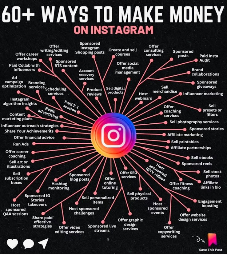
I saw this post and what I liked about it was that it was screenshot-able. This means it’s a lot...