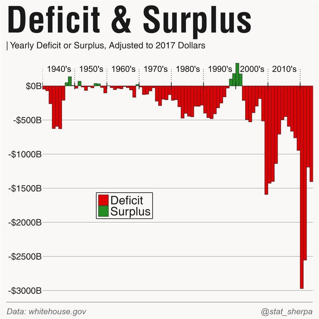
Graph showing the yearly deficit or surplus since the 1940's. This is a wild-looking graph because you can see, pretty obviously, that within the last few years something major, major, major, major has been happening that is increasing our deficit and we need to get it down to normal, manageable levels, or else the country could potentially go defunct.
Analyzed by Swipebot
Loading analysis...