CEO-to-Workers Pay Ratio
Published on Aug 30, 2017
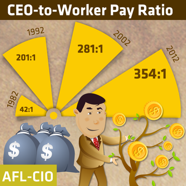
This fun chart illustrates the growing income gap.
Analyzed by Swipebot
Loading analysis...
Search for a command to run...


This was a cool graphic showing Tropicana’s sales went DOWN after swapping their iconic orange-with-a-straw image for a plain glass...
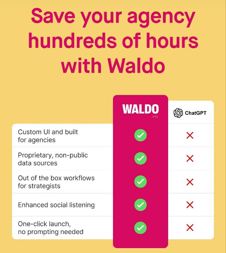
This is a cool graph that shows with this software what you get vs. what you don't get with ChatGPT.
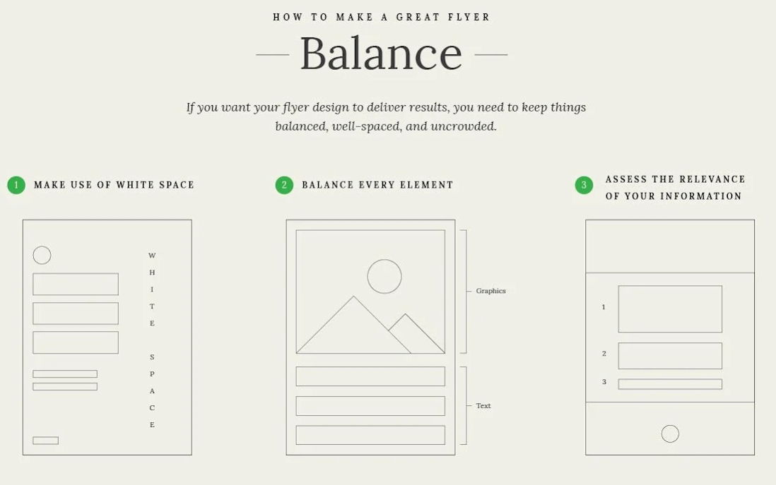
These flyer wireframes demonstrate the design elements that contribute to a flyer’s visual appeal.

Eye-popping image showing what you could eat instead of scarfing down a Big Mac meal

Here’s two cool Adobe Photoshop ads. I personally have stopped using Photoshop as there’s so many easier softwares to use...
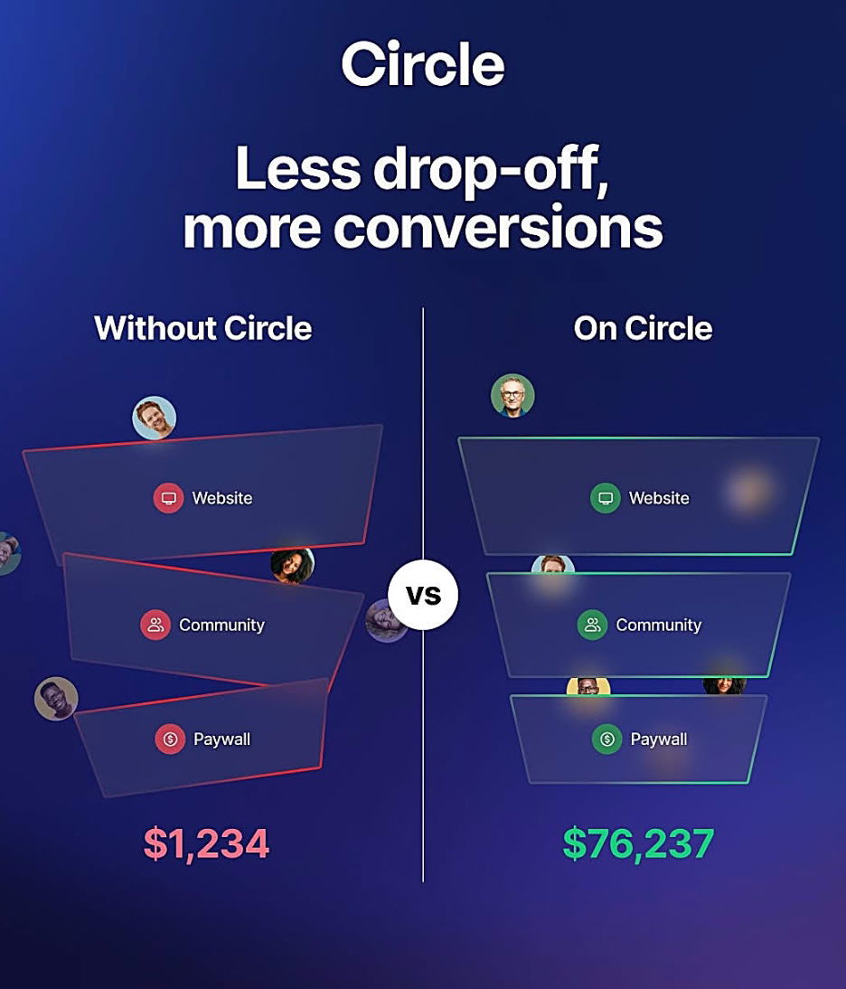
I love a good comparison chart, and this cool chart shows the community platform Circle and that without Circle, you...