This is one of the best looking menu's ever! The images are so crisp, the callouts are perfectly placed.
I'm not sure it's exactly the easiest thing to read, but it sure as hell could win a design award!
Here's some other pages from the menu:


I'm personally not a huge fan of "too much" design in web design, as I care more about the messaging...

When this style of AC was around it was so easy to use. An exemplary example of great design.I wouldn't...

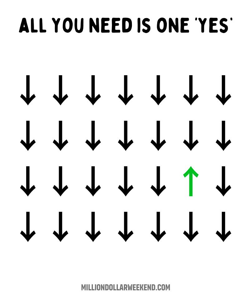
Quick reminder that it doesn't matter how many times you hear "No" you only need one "Yes".Business is the only...

This chart perfectly captures the messy (but normal) journey for marketers.

This is a fun comparison of Apple products from 2001 being able to store 1,000 songs...and now your watch can...

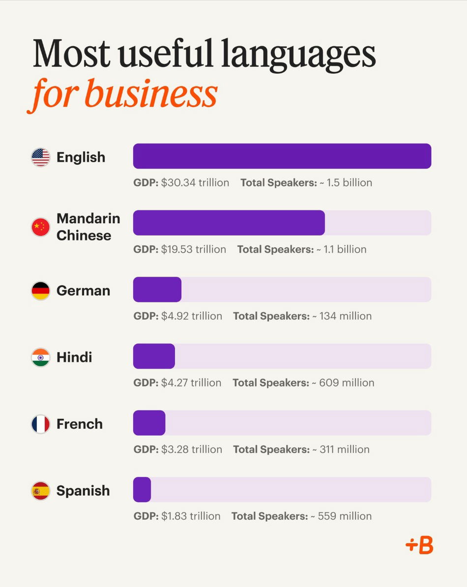
This chart shows the top languages for business. These are spoken in major markets, so knowing them helps companies grow...