Apple's Revenue Graph
Published on Aug 30, 2017
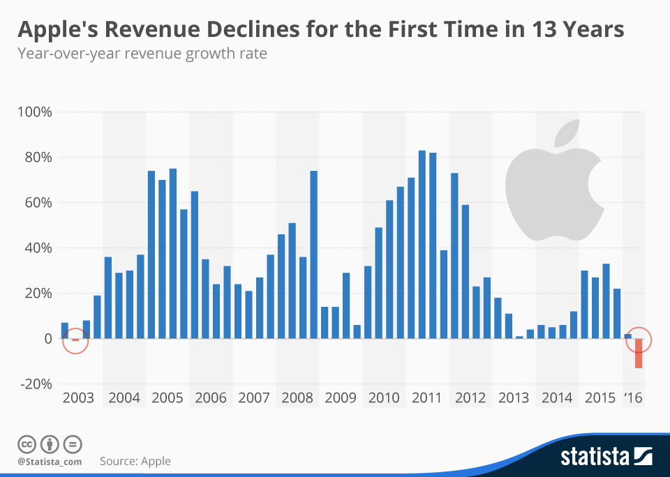
This graph was used to illustrate Apple's revenue decline after a 13-year streak.
Analyzed by Swipebot
Loading analysis...
Search for a command to run...


This was a cool graphic showing Tropicana’s sales went DOWN after swapping their iconic orange-with-a-straw image for a plain glass...
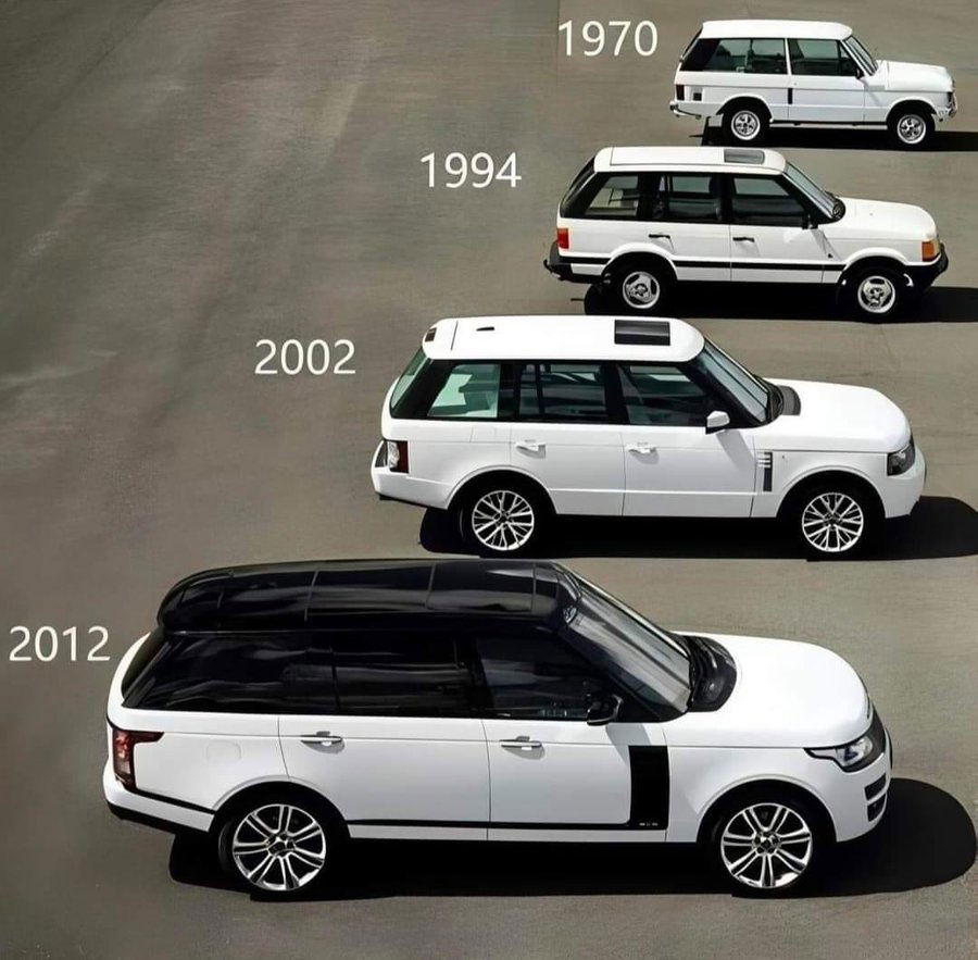
This is a cool chart that shows the styling evolution of Range Rovers from 1970 to 2012…while each successive versions...
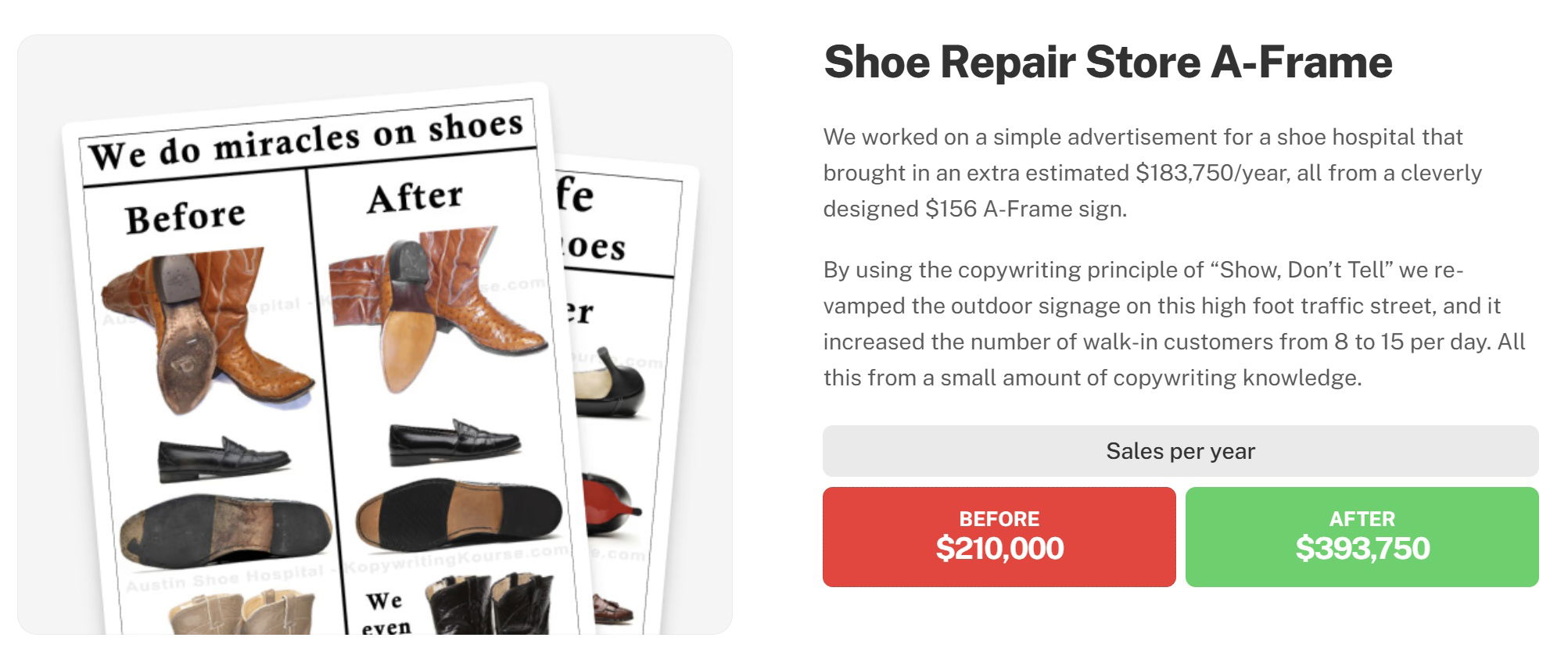
This is a before and after results testimonial on the Copywriting Course join page. Instead of explaining copywriting, it just...
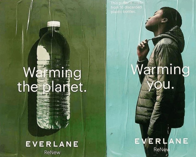
Great double page spread showing the waste of a plastic bottle turned into a jacket.

This shows the difference between Waymo and Tesla cameras. It shows that Waymo has a lot more cameras (29), five...

Comparison charts are an amazing way to show your YOUR PRODUCT versus your competitors product, and they're very simple.In one...